GB Pixel Jam 2024 /Stranded on the Phantom planet
A downloadable asset pack
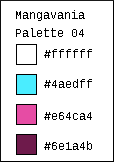
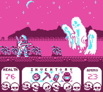
My submission to the GB Pixel Art Jam 2024 where I had to create an image for the GameBoy Color by using my choice of one of the four available palettes . There was no other theme for the jam than the color palette choice.
As an additional challenge, I chose the palette I thought would be the most difficult for me considering my style, while staying true to my aesthetic.
I built the art with the concept on mind of a atmospheric, exploratory platformer.
edit : I added a corrected version of the downloadable file, there was a single pink dot near the UI that wasn't supposed to be there.
Jam link:
https://itch.io/jam/gbpixelartjam24
| Status | Released |
| Category | Assets |
| Rating | Rated 5.0 out of 5 stars (3 total ratings) |
| Author | NathanLurker |
| Tags | 2D, Game Boy, gbpixelartjam, Horror, Sci-fi |
Download
Download
GBArtJam2024-corrected.png 4 kB


Comments
Log in with itch.io to leave a comment.
Looks great! That UI is so charming!
Nice job! The UI skulls have tons of personality. This really looks like an actual CGA-era game!
Thank you very much, glad you like the skulls, I would like to experiment more with UI ornaments in the future.
Ghost busted :)
This is freaking cool, love the palette choice for the subject matter, feels neo futuristic, alien and spooky all in one! Great character designs too
Thank you, I was trying to bring all of that in this image, I'm glad you feel that way.
Yo, this is awesome! Great job! What was your thought process that made you choose this theme? I really dig the typography there (numbers and letters), gives a nice touch to the whole scene!
Thanks. I started by picking the most unusual palette for me, as an additional challenge. It is a very bold palette with striking contrast, I wanted to see if I could make an atmospheric thing out of it. I thought I might be able to use the 2 shades of pink primarily as eerie background instead of candy coated highlights, and the white and cyan should be used for characters and monsters. If my character was going to be primarily white, I thought it make sense to have a space suit, and as monsters, I thought of ghosts, and wondered if bold white and cyan could turn creepy. The thought process was really to bend a palette that doesnt seem eerie into an atmospheric horror game scene. I loosely wanted to connect the mood with my submission from last year. For the typography, I used a free font called "smallestpixels" that you can find here although I had to tweak spaces between letters. I'd like to try my hand at making my own font at some point.
Very cool! The whole thing is a great piece and I'd totally play this if it was a game. I particularly like your inventory bar with the skulls - that's an inspired use of tiling!
Thank you, I started a bit late on this jam so I wish I'd have had more time to fine tune the skulls even though I'm pretty happy with what I got. I think I could have found a way to maybe make the skulls smaller and a bit less intrusive, or maybe skulls just in the corners with other bones covering a horizontal line between them. In any case, I really enjoyed the process, I'm glad you liked the idea of it.
Nah they give it such a cool chunky vibe, it's a defining feature 😉 but yeah it's always tricky using large scale white, it can be very eye catching. The white skulls and white boxes definitely pull your eye down. But I reckon it kind of suits the vibrancy of the pink up top.